Concept Designs
Below are six concept designs to show how the same content can look very different based on colors and fonts and page set up. There are specific design decisions that are made to showcase your website to reflect your residents.
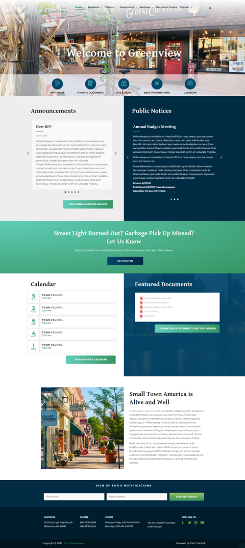
City of Greenview
Emotional Feel: Community, stylish
Image choice for header is very important
1 row of navigation that is centered
Search icon opens a search field overlay
Logo/navigation overlay the image/slide show
Icon row overlays image/slideshow which conserves space
Announcements and Public Notices are displayed as full articles, one at a time on a carousel
Footer color background with no icons
City of Mapleview
Emotional Feel: Clean and professional
2 rows of navigation
Search icon opens a search field overlay
Stacked header image/slide show
Icon row stacked below header
Public Notices are full content. Announcements are a carousel inside a two tab format sharing space with the calendar list
Footer color background with icons


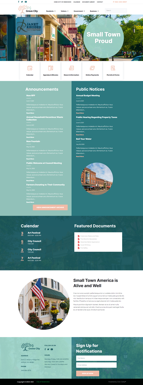
Grove City
Similar set up to Mapleview, but colors and organization change its feeling.
Emotional Feel: Inviting and confident
2 rows of navigation
Search field in navigation row
Logo/navigation stacked over the image/slide show
Icon row stacked under image/slide show for added emphasis
Announcements and Public Notices are excerpted lists.
Footer image background with no icons.
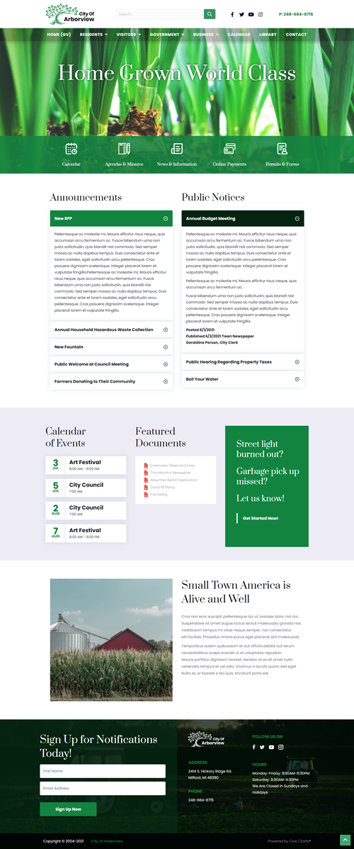
City of Arborview
Emotional Feel: Agricultural and fresh
1 row of navigation
Search field in header
Navigation is an overlay over header image/slide show
Icon row overlay header to allow background image to be taller
Announcements and Public Notices are displayed as full content in an accordion
Footer image background with no icons.

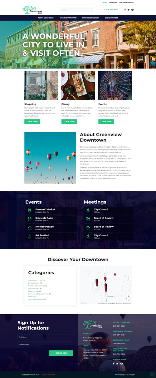
Greenville DDA
Emotional Feel: Sophisticated yet inviting
2 rows of navigation
Search field in header
Navigation is stacked over header image/slide show
Three boxes below header image highlight most important content for website audience
Events and Meetings are side by side lists
Directory overview and map
Footer image background with no icons
Oakview DDA
Emotional Feel: Very dependent on event images to portray feel of home page
1 row of navigation
Search field in header
Instead of a main header image/slide show, there is a display of events using their featured images
Calendar row show Events with excerpted content and a Meeting list
Directory overview and map
Footer has image background and icons to highlight information


